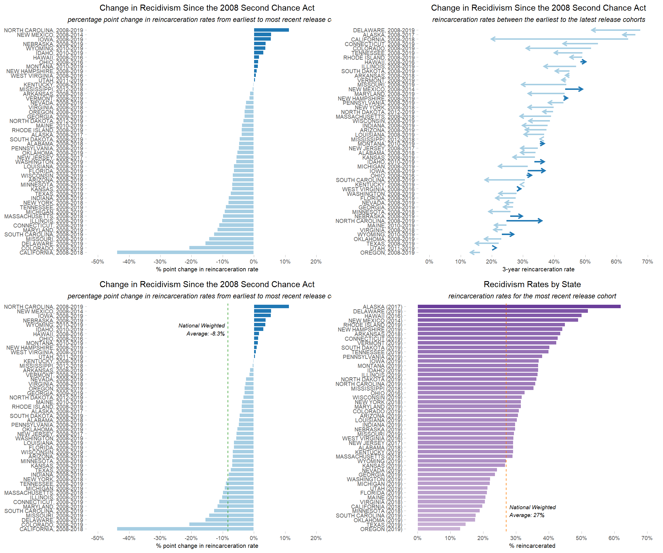
Visualizing State Recidivism Rates
Introduction
This model code will allow you to produce four data visualizations from the public report 50 States, 1 Goal: Examining State-Level Recidivism Trends in the Second Chance Act Era. Utilizing the provided model code in the R statistical programming language on your local computer, you will be able to replicate the process of importing aggregated recidivism data, conducting simple calculations, merging datasets, and finally creating data visualizations displaying recidivism trends through bar charts and arrow charts. This model code is reproducible and includes quality assurance checks for accuracy.
Setup
First, we will load all packages required for this code. If you don’t already have the following packages installed, you should install them first.
library(tidyverse)
library(scales)
library(RColorBrewer)
Import Data
Now, we can load the data needed for this analysis: state recidivism rates by year and prison release totals by state.
The CSG Justice Center collected state-level recidivism data by looking for recidivism rates over the last 15 years in published state reports. The most commonly reported recidivism metric was reincarceration within 3 years of release from prison (by release cohort); however, not all states publish this information. Similarly, not all states reported recidivism rates in 2008 and 2019 (the most recent year likely to be feasible to report for a 3-year observation window). When the information was not publicly available, members of the CSG Justice Center Research Division recorded the recidivism rates for cohorts exiting prison in the years that were closest to 2008 and 2019. Finally, they reached out to state officials to obtain recidivism rates when none were available. Additional information on the source of each recidivism data point is available in the 50 States, 1 Goal report.
Prison release totals come from the Bureau of Justice Statistics’ National Prisoner Stastics (NPS) data for 2022.
Both datasets have already been cleaned and formatted for analysis (however, the code to prepare the data is not shown here). We have uploaded cleaned versions of these datasets to GitHub, and you can download and import them directly into R by running the following code.
# load data from GitHub

# State-by-State data on recidivism rates
## url to raw data file on GitHub
rates_url <- "https://github.com/CSGJusticeCenter/va_data/raw/main/model_code/state_recidivism/recidivism_rates_by_state.csv"

## read csv from GitHub
rates_in <- read_csv(rates_url)

# 2022 state prison releases
## url to raw data file on GitHub
rels_url <- "https://github.com/CSGJusticeCenter/va_data/raw/main/model_code/state_recidivism/nps_releases_by_state_2022.csv"

## read csv from GitHub
rels_in <- read_csv(rels_url)
Data Wrangling
Recidivism Rates
We will start with analyzing changes in recidivism rates over time for each state. Let’s look at the first 5 rows of our rates data to make sure it was imported properly.
head(rates_in)
#> # A tibble: 6 × 18
#>   State    `2004` `2005` `2006` `2007` `2008` `2009` `2010` `2011` `2012` `2013`
#>   <chr>     <dbl>  <dbl>  <dbl>  <dbl>  <dbl>  <dbl>  <dbl>  <dbl>  <dbl>  <dbl>
#> 1 ALABAMA   0.288 NA     NA     NA      0.34   0.326  0.321  0.31   0.309  0.319
#> 2 ALASKA   NA     NA      0.7    0.68   0.66   0.66   0.66   0.66   0.65   0.66
#> 3 ARIZONA  NA     NA     NA     NA      0.375  0.383  0.378  0.389  0.394  0.388
#> 4 ARKANSAS  0.444  0.414  0.374  0.403  0.449  0.416  0.432  0.482  0.518  0.561
#> 5 CALIFOR…  0.656  0.668  0.675  0.651  0.637  0.61   0.543  0.446  0.25   0.222
#> 6 COLORADO  0.525  0.532  0.532  0.518  0.518  0.499  0.488  0.461  0.486  0.5
#> # ℹ 7 more variables: `2014` <dbl>, `2015` <dbl>, `2016` <dbl>, `2017` <dbl>,
#> #   `2018` <dbl>, `2019` <dbl>, `2020` <dbl>
This looks like what we expect to see, so we can move on with preparing the data for analysis and visualization. First, we will check the columns and values in the data.
colnames(rates_in)
#>  [1] "State" "2004"  "2005"  "2006"  "2007"  "2008"  "2009"  "2010"  "2011"
#> [10] "2012" "2013" "2014" "2015" "2016" "2017" "2018" "2019" "2020"unique(rates_in$State)
#> [1] "ALABAMA" "ALASKA" "ARIZONA" "ARKANSAS"
#> [5] "CALIFORNIA" "COLORADO" "CONNECTICUT" "DELAWARE"
#> [9] "FLORIDA" "GEORGIA" "HAWAII" "IDAHO"
#> [13] "ILLINOIS" "INDIANA" "IOWA" "KANSAS"
#> [17] "KENTUCKY" "LOUISIANA" "MAINE" "MARYLAND"
#> [21] "MASSACHUSETTS" "MICHIGAN" "MINNESOTA" "MISSISSIPPI"
#> [25] "MISSOURI" "MONTANA" "NEBRASKA" "NEVADA"
#> [29] "NEW HAMPSHIRE" "NEW JERSEY" "NEW MEXICO" "NEW YORK"
#> [33] "NORTH CAROLINA" "NORTH DAKOTA" "OHIO" "OKLAHOMA"
#> [37] "OREGON" "PENNSYLVANIA" "RHODE ISLAND" "SOUTH CAROLINA"
#> [41] "SOUTH DAKOTA" "TENNESSEE" "TEXAS" "UTAH"
#> [45] "VERMONT" "VIRGINIA" "WASHINGTON" "WEST VIRGINIA"
#> [49] "WISCONSIN" "WYOMING" "Washington DC"We are only interested in the years 2008 through 2019, so we can drop the other years. We also don’t need rates for Washington, DC.
rates <- rates_in |>
  select(c(State, "2008":"2019")) |>
  filter(State != "Washington DC")
Check the columns and values again after dropping.
colnames(rates)
#>  [1] "State" "2008"  "2009"  "2010"  "2011"  "2012"  "2013"  "2014"  "2015"
#> [10] "2016" "2017" "2018" "2019"unique(rates$State)
#> [1] "ALABAMA" "ALASKA" "ARIZONA" "ARKANSAS"
#> [5] "CALIFORNIA" "COLORADO" "CONNECTICUT" "DELAWARE"
#> [9] "FLORIDA" "GEORGIA" "HAWAII" "IDAHO"
#> [13] "ILLINOIS" "INDIANA" "IOWA" "KANSAS"
#> [17] "KENTUCKY" "LOUISIANA" "MAINE" "MARYLAND"
#> [21] "MASSACHUSETTS" "MICHIGAN" "MINNESOTA" "MISSISSIPPI"
#> [25] "MISSOURI" "MONTANA" "NEBRASKA" "NEVADA"
#> [29] "NEW HAMPSHIRE" "NEW JERSEY" "NEW MEXICO" "NEW YORK"
#> [33] "NORTH CAROLINA" "NORTH DAKOTA" "OHIO" "OKLAHOMA"
#> [37] "OREGON" "PENNSYLVANIA" "RHODE ISLAND" "SOUTH CAROLINA"
#> [41] "SOUTH DAKOTA" "TENNESSEE" "TEXAS" "UTAH"
#> [45] "VERMONT" "VIRGINIA" "WASHINGTON" "WEST VIRGINIA"
#> [49] "WISCONSIN" "WYOMING"These look correct, so now we can pivot the data to put each year on its own row. The names of the year columns will go into the new column year, and the values from each year will go into the new column metric. The State column won’t change.
# Restructure file from wide to long (i.e., put each year on a row for each state)
rates_long <- rates |>
  pivot_longer(cols = -State,
               names_to = "year",
               values_to = "metric")
Let’s look at the restructured data:
str(rates_long)
#> tibble [600 × 3] (S3: tbl_df/tbl/data.frame)
#>  $ State : chr [1:600] "ALABAMA" "ALABAMA" "ALABAMA" "ALABAMA" ...
#>  $ year  : chr [1:600] "2008" "2009" "2010" "2011" ...
#>  $ metric: num [1:600] 0.34 0.326 0.321 0.31 0.309 ...
The new structure looks right, except the new year column was created as character, so we will change it to numeric.
rates_long <- rates_long |>
  mutate(year = as.numeric(year))
We will also check for any records where the metric column is empty.
# Check number of records with missing/not missing rates
rates_long |>
  summarize(total_n = nrow(rates_long),
            missing_n = sum(is.na(metric)),
            valid_n = sum(!is.na(metric)))
#> # A tibble: 1 × 3
#>   total_n missing_n valid_n
#>     <int>     <int>   <int>
#> 1     600        72     528
Now we will drop the 72 records with missing values in the metric column.
rates_nomiss <- rates_long |>
  filter(!is.na(metric))
Check to make sure the correct number of records were dropped—it should match our valid_n figure above:
nrow(rates_nomiss)
#> [1] 528
Next, we will aggregate the data to get the earliest and latest years of data for each state, as well as the rates for those years.
# group rows by state to get rates for the earliest & latest years only
rates_by_state <- rates_nomiss |>
  group_by(State) |>
  summarize(
    earliest_year = min(year),
    latest_year = max(year),
    earliest_rate = metric[which.min(year)],
    latest_rate = metric[which.max(year)]
    ) |>
  ungroup()
Then we’ll compute the percent and percentage point differences in rates between earliest and latest years available.
rates_by_state <- rates_by_state |>
  mutate(
    ## percent change
    rate_change_percent = ((latest_rate - earliest_rate) / earliest_rate),
    ## percentage point change
    rate_change_raw = ((latest_rate - earliest_rate) * 100)
    )
Prison Releases
In addition to recidivism rates, we also need to calculate some weighted national averages. To do this, we will need the number of people released from prison in each state (i.e., the number of people who could recidivate).
Let’s look at the first six rows of the 2022 National Prisoner Statistics releases to make sure the data was imported properly.
head(rels_in)
#> # A tibble: 6 × 2
#>   State      releases_2022
#>   <chr>              <dbl>
#> 1 ALABAMA             8978
#> 2 ALASKA              1810
#> 3 ARIZONA            11832
#> 4 ARKANSAS            7048
#> 5 CALIFORNIA         32055
#> 6 COLORADO            5260
This looks like what we expect to see, so we can move forward with preparing the data for analysis and visualization. Next, let’s make sure this file contains the information we are interested in.
str(rels_in)
#> spc_tbl_ [50 × 2] (S3: spec_tbl_df/tbl_df/tbl/data.frame)
#>  $ State        : chr [1:50] "ALABAMA" "ALASKA" "ARIZONA" "ARKANSAS" ...
#>  $ releases_2022: num [1:50] 8978 1810 11832 7048 32055 ...
#>  - attr(*, "spec")=
#>   .. cols(
#>   ..   State = col_character(),
#>   ..   releases_2022 = col_double()
#>   .. )
#>  - attr(*, "problems")=<externalptr>
The file has the number of rows we expected, and we won’t need to do any additional formatting on the State column in order to merge this data with the rates data from earlier.
Now we can match the 2022 release counts for each state with their respective recidivism rates.
# merge rates and releases, matching on State column
rates_rels <- rates_by_state |>
  left_join(rels_in, by = "State")
After merging, we’ll check the structure of the file again.
str(rates_rels)
#> tibble [50 × 8] (S3: tbl_df/tbl/data.frame)
#>  $ State              : chr [1:50] "ALABAMA" "ALASKA" "ARIZONA" "ARKANSAS" ...
#>  $ earliest_year      : num [1:50] 2008 2008 2008 2008 2008 ...
#>  $ latest_year        : num [1:50] 2018 2017 2019 2018 2018 ...
#>  $ earliest_rate      : num [1:50] 0.34 0.66 0.375 0.449 0.637 0.518 0.54 0.676 0.277 0.268 ...
#>  $ latest_rate        : num [1:50] 0.292 0.62 0.307 0.436 0.198 ...
#>  $ rate_change_percent: num [1:50] -0.1412 -0.0606 -0.1813 -0.029 -0.6892 ...
#>  $ rate_change_raw    : num [1:50] -4.8 -4 -6.8 -1.3 -43.9 ...
#>  $ releases_2022      : num [1:50] 8978 1810 11832 7048 32055 ...
Our merged file has the right number of rows and a new “releases_2022” column, but is there a value for every state?
rates_rels |>
  mutate(has_rel = !is.na(releases_2022)) |>
  summarize(has_rel = sum(has_rel))
#> # A tibble: 1 × 1
#>   has_rel
#>     <int>
#> 1      50
Yes—all states had a matching record in the 2022 National Prisoner Statistics data.
Weighted National Averages
Now we can calculate national averages for recidivism rates. We can’t just add up the rates and divide by 50, however. Because the number of people released from prison can vary greatly from state to state, we want to weigh the recidivism rate of each state by the size of their 2022 release cohort. This weighted national average accounts for differences in release cohorts across states.
First, we’ll drop any records that are missing data. Based on the step above, we don’t expect any records to be dropped, but we will do this step as an extra precaution.
rates_rels_nomiss <- rates_rels |>
  filter(!is.na(releases_2022))
The data frame should still have 50 records:
nrow(rates_rels_nomiss)
#> [1] 50
Now we can aggregate the data to calculate four different weighted averages:
1. earliest rate
2. latest rate
3. rate difference—percentage
4. rate difference—percentage points
rates_natl_avgs <- rates_rels_nomiss |>
  summarize(
    earliest_rate_w_avg = weighted.mean(earliest_rate, releases_2022),
    latest_rate_w_avg = weighted.mean(latest_rate, releases_2022),
    percent_chg_w_avg = weighted.mean(rate_change_percent, releases_2022),
    pct_pts_chg_w_avg = weighted.mean(rate_change_raw, releases_2022)
  )
Data Visualizations
Percentage Point Change in Recidivism Rates by Year by State
Before we make this visualization, we need to create some new columns to help with the plot: a label for each state and a flag to indicate whether the rate change was positive or negative. We’ll also set the color palette for our plots here.
# Prepare data for plot
rates_plot <- rates_by_state |>
  mutate(
    ## create column of labels with valid years for each state
    yaxis = paste0(State, ", ", earliest_year, "-", latest_year),
    ## create flag for pos/neg change - for graph colors
    rate_chg_dir = case_when(rate_change_raw <= 0 ~ "neg",
                             rate_change_raw > 0 ~ "pos")
    )

# set colors for plots - use colorblind friendly "Paired" palette
plot_cols <- brewer.pal(12, "Paired")[1:2]
Let’s check the columns we created to make sure everything worked. First, we’ll check the first 5 values of the new yaxis column.
head(rates_plot$yaxis)
#> [1] "ALABAMA, 2008-2018"    "ALASKA, 2008-2017"     "ARIZONA, 2008-2019"
#> [4] "ARKANSAS, 2008-2018"   "CALIFORNIA, 2008-2018" "COLORADO, 2008-2019"
Then we’ll make sure the rate_chg_dir flag was calculated properly. If rate_chg_dir is “neg,” the minimum and maximum values should be negative; if it’s “pos,” the values should be positive.
rates_plot |>
  group_by(rate_chg_dir) |>
  summarize(min_rt = min(rate_change_raw),
            max_rt = max(rate_change_raw))
#> # A tibble: 2 × 3
#>   rate_chg_dir  min_rt max_rt
#>   <chr>          <dbl>  <dbl>
#> 1 neg          -43.9   -0.330
#> 2 pos            0.400 11.3
Everything looks good! Now that the data is prepped, we can create our visualizations using ggplot.
To show states in order by percentage point change, we will set the label variable we created to a factor, sorted by rate_change_raw. The rate change flag variable is used to set the color of the bars.
# create plot showing change in recidivism rates by year by state
p_recid_raw_chg <- rates_plot |>
  ## reorder data by rate change value
  mutate(yaxis = fct_reorder(yaxis, rate_change_raw)) |>
  ## plot percentage point change
  ggplot(aes(x = rate_change_raw,
             y = yaxis,
             fill = rate_chg_dir)) +
  ## set graph type, add white line around bars for visibility
  geom_col(color = "white") +
  ## fill bars with set colors
  scale_fill_manual(values = plot_cols) +
  ## adjust numbers on x-axis
  scale_x_continuous(
    limits = c(-50, 20),
    breaks = seq(-50, 20, by = 10),
    labels = scales::percent_format(scale = 1)
  ) +
  ## set title and labels
  labs(
    title = "Change in Recidivism Since the 2008 Second Chance Act",
    subtitle = "percentage point change in reincarceration rates from earliest to most recent release cohort",
    x = "% point change in reincarceration rate",
    y = NULL
  ) +
  ## set color/formats of plot area
  theme_light() +
  ## set text and line options
  theme(
    legend.position = "none",
    axis.title.x = element_text(size = 8),
    axis.text = element_text(size = 7),
    plot.title = element_text(size = 11,
                              hjust = 0.5),
    plot.subtitle = element_text(size = 9,
                                 face = "italic",
                                 hjust = 0.5),
    panel.border = element_blank(),
    panel.grid.major = element_blank(),
    panel.grid.minor = element_blank()
  )
# show plot
p_recid_raw_chg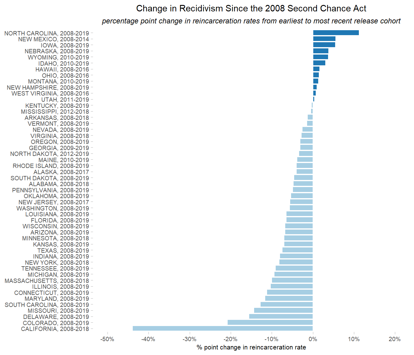
This is what we wanted to see—the bars are in descending order by percentage point change, and bars for states whose recidivism rates increased are a different color than those whose rates decreased.
We can use ggsave to save this graph as a .png file in an “images” folder for later use. We can specify the size of the image here as well.
ggsave("images/Recidivism_Rate_Raw_Change.png",
       plot = p_recid_raw_chg,
       width = 7, height = 9)
Let’s make another visualization.
Rates for Earliest and Latest Years of Data by State
To show states in descending order by each state’s recidivism rate in the earliest year of data available, we will set the label variable we created to a factor, sorted by earliest_rate. We’ll use the rage_chg_dir flag to determine colors again.
# create plot showing earliest and latest recidivism rates by state
p_rates_first_last <- rates_plot |>
  ## reorder data by rate for earliest year
  mutate(yaxis = fct_reorder(yaxis, earliest_rate)) |>
  ## format rates for plot
  mutate(earliest_plot = earliest_rate * 100,
         latest_plot = latest_rate * 100) |>
  ## graph earliest and latest rates
  ggplot(aes(x = earliest_rate, xend = latest_rate,
             y = yaxis, yend = yaxis,
             color = rate_chg_dir)) +
  ## set graph type and line options
  geom_segment(
    linewidth = 1,
    lineend = "butt",
    linejoin = "mitre",
    arrow = arrow(length = unit(0.02, "npc"))
  ) +
  ## fill lines with set colors
  scale_color_manual(values = plot_cols) +
  ## adjust numbers on x-axis
  scale_x_continuous(
    limits = c(0, 0.7),
    breaks = seq(0, 0.7, by = 0.1),
    labels = percent_format()
  ) +
  ## set title and labels
  labs(
    title = "Change in Recidivism Since the 2008 Second Chance Act",
    subtitle = "reincarceration rates between the earliest to the latest release cohorts",
    x = "3-year reincarceration rate",
    y = NULL
  ) +
  ## set color/formats of plot area
  theme_light() +
  ## set text and line options
  theme(
    legend.position = "none",
    axis.title.x = element_text(size = 8),
    axis.text = element_text(size = 7),
    plot.title = element_text(size = 11,
                              hjust = 0.5),
    plot.subtitle = element_text(size = 9,
                                 face = "italic",
                                 hjust = 0.5),
    panel.border = element_blank(),
    panel.grid.major = element_blank(),
    panel.grid.minor = element_blank()
  )
# show plot
p_rates_first_last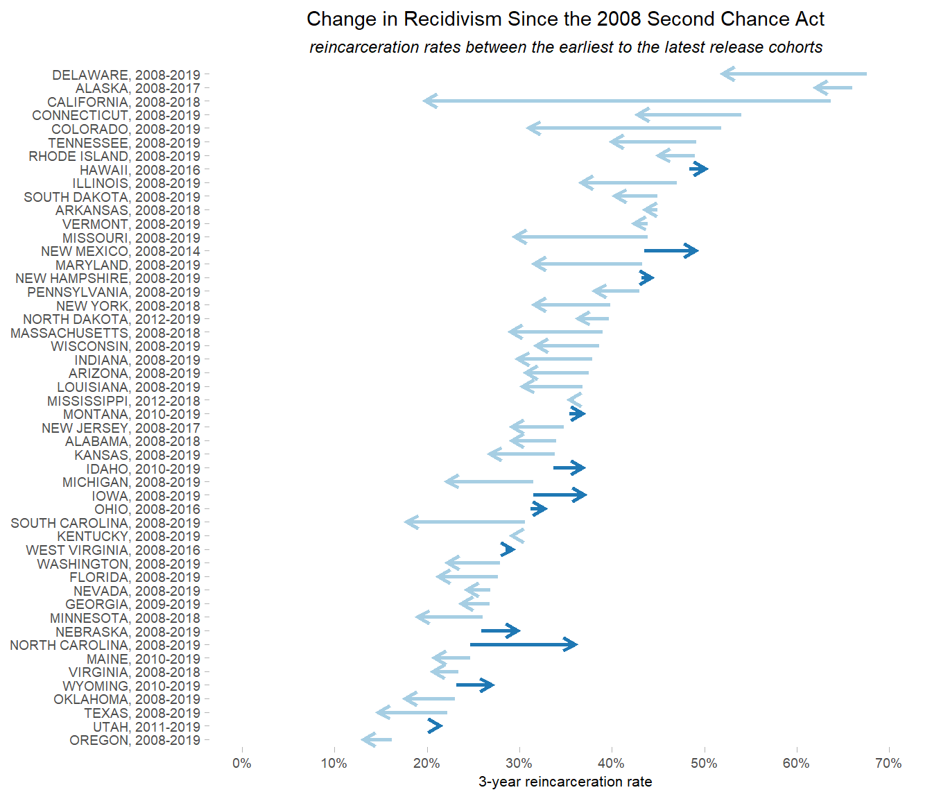
Here we have a graph that shows not only the earliest and latest recidivism rates for each state, but also the direction of the percentage point change (via the arrows as well as the color of the lines).
We can save this plot as a .png file as well.
ggsave("images/Earliest_Latest_Recid_Rates.png",
       plot = p_rates_first_last,
       width = 7, height = 9)
Rate Change with National Average
We can use the percentage point change plot we made earlier (p_recid_raw_chg) and add a line to it representing the national weighted average for comparison.
First, we need to get the average percentage point change and set the color of the line.
# get average change in percentage points - round to 1 decimal point
avg_chg_line <- round(rates_natl_avgs$pct_pts_chg_w_avg, 1)

# set color of average line
avg_chg_col <- brewer.pal(12, "Paired")[4]
Now we can add the line to our plot.
# build plot
p_recid_raw_chg_avg <-
  ## Get previously created plot with change in recidivism rates
  p_recid_raw_chg +
  ## add average line
  geom_vline(xintercept = avg_chg_line,
             color = avg_chg_col,
             linetype = "dashed") +
  ## add label to line
  annotate("text", x = avg_chg_line-1, y = 45, hjust = 1,
           label = paste0("National Weighted\nAverage: ", avg_chg_line, "%"),
           size = 2.5, fontface = "italic")
# show plot
p_recid_raw_chg_avg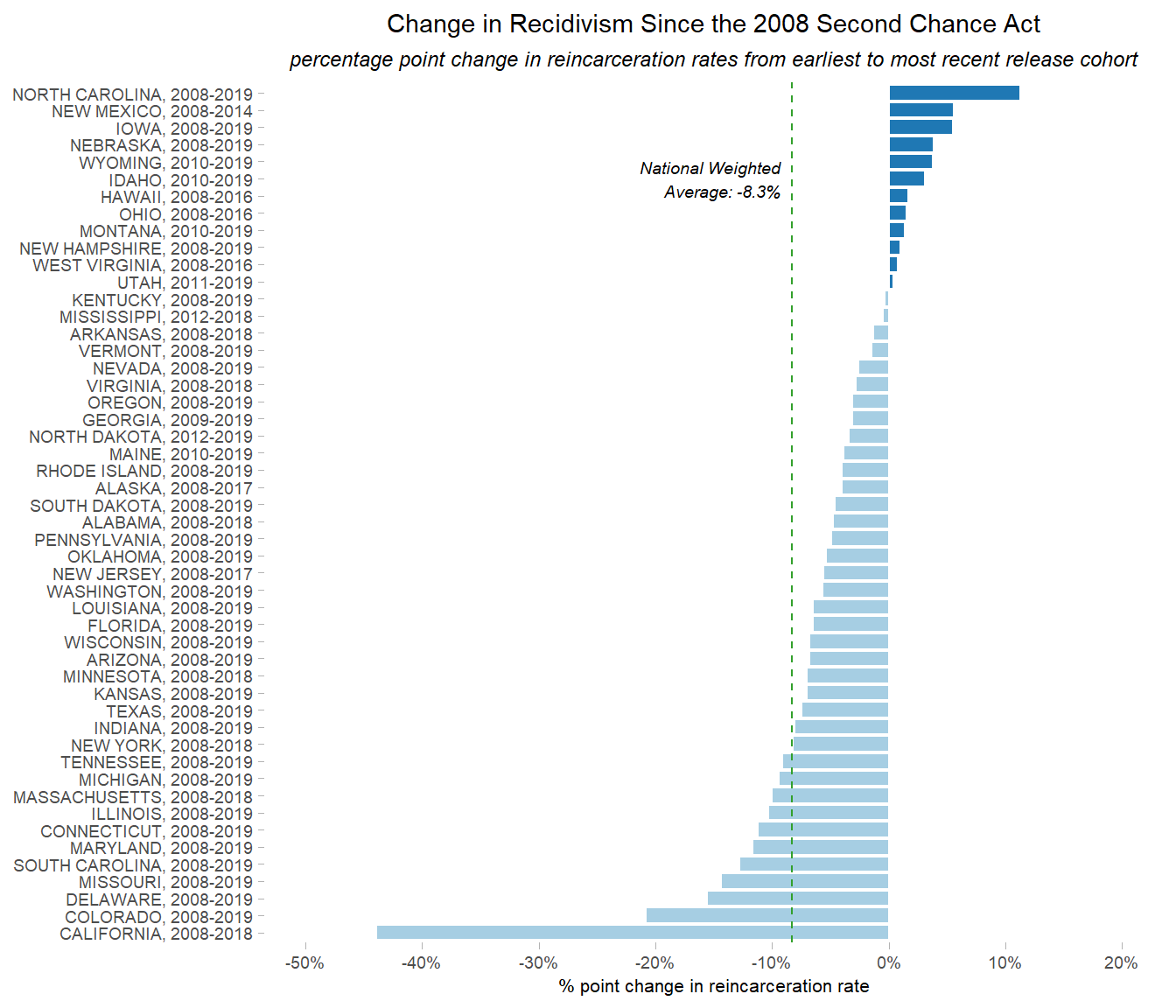
Our plot now has a vertical green line at -8.3% to indicate what the national weighted average percentage point change was.
We can save the updated plot as a .png file for future use:
ggsave("images/Recidivism_Rate_Raw_Change_Natl_Avg.png",
       plot = p_recid_raw_chg_avg,
       width = 7, height = 9)
Recidivism Rates with National Average
This time we will make a brand new plot: the most recent recidivism rate for each state, plus a line for the weighted national average.
First, we need to get the average latest recidivism rate. Since this is a new plot, we’ll also set different colors for the bars and average line.
# get average latest rate
avg_latest_line <- round(rates_natl_avgs$latest_rate_w_avg, digits = 3)

# set color of average line
avg_latest_col <- brewer.pal(12, "Paired")[8]

# set colors for rate bars
rate_cols <- brewer.pal(12, "Paired")[9:10]
Now we can create our plot. To show states in order by latest rate, we will create a label, set it as a factor, and sort it by latest_rate.
# create plot showing latest recidivism rates by state, with national weighted average for reference
p_recid_latest_avg <-
  rates_plot |>
  ## update yaxis label to only show latest year
  mutate(yaxis = paste0(State, " (", latest_year, ")")) |>
  ## reorder data by latest rate
  mutate(yaxis = fct_reorder(yaxis, latest_rate)) |>
  ## plot percentage point change, set colors based on latest rate
  ggplot(aes(x = latest_rate,
             y = yaxis,
             fill = latest_rate)) +
  ## set graph type, add white line around bars for visibility
  geom_col(color = "white") +
  ## create gradient color scale for bars
  scale_fill_gradient(low = rate_cols[1],
                      high = rate_cols[2]) +
  ## adjust numbers on x-axis
  scale_x_continuous(limits = c(0, 0.7),
                     breaks = seq(0, 0.7, by = 0.1),
                     labels = percent_format()) +
  ## set title and labels
  labs(
    title = "Recidivism Rates by State",
    subtitle = "reincarceration rates for the most recent release cohort",
    x = "% reincarcerated",
    y = NULL
  ) +
  ## set color/formats of plot area
  theme_light() +
  ## set text and line options
  theme(
    legend.position = "none",
    axis.title.x = element_text(size = 8),
    axis.text = element_text(size = 7),
    plot.title = element_text(size = 11,
                              hjust = 0.5),
    plot.subtitle = element_text(size = 9,
                                 face = "italic",
                                 hjust = 0.5),
    panel.border = element_blank(),
    panel.grid.major = element_blank(),
    panel.grid.minor = element_blank()
  ) +
  ## add average line & label
  geom_vline(xintercept = avg_latest_line,
             color = avg_latest_col,
             linetype = "dashed") +
  annotate("text", x = avg_latest_line+0.01, y = 5, hjust = 0,
           label = paste0("National Weighted\nAverage: ",
                          avg_latest_line*100, "%"),
           size = 2.5, fontface = "italic")
# show plot
p_recid_latest_avg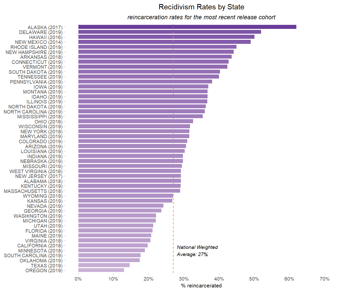
We now have a graph showing the most recent recidivism rate for each state, in descending order, and a vertical line representing the national weighted average rate.
Save this plot as a .png file:
ggsave("images/Latest_Recidivism_Rate_Natl_Avg.png",
       plot = p_recid_latest_avg,
       width = 7, height = 9)
From here, the saved graphs can be inserted into reports, presentations, etc. Because they were created using code, we have a record of how each graph was created and they can be easily replicated or modified.
R Session Info
#> ─ Session info ───────────────────────────────────────────────────────────────
#>  setting  value
#>  version  R version 4.4.2 (2024-10-31 ucrt)
#>  os       Windows 11 x64 (build 26100)
#>  system   x86_64, mingw32
#>  ui       RTerm
#>  language (EN)
#>  collate  English_United States.utf8
#>  ctype    English_United States.utf8
#>  tz       America/New_York
#>  date     2025-03-19
#>
#> ─ Packages ───────────────────────────────────────────────────────────────────
#>  ! package      * version date (UTC) lib source
#>  P bit            4.5.0.1 2024-12-03 []  CRAN (R 4.4.2)
#>  P bit64          4.5.2   2024-09-22 []  CRAN (R 4.4.2)
#>  P cli            3.6.3   2024-06-21 []  RSPM
#>  P colorspace     2.1-1   2024-07-26 []  CRAN (R 4.4.2)
#>  P crayon         1.5.3   2024-06-20 []  RSPM
#>  P curl           6.0.1   2024-11-14 []  RSPM
#>  P digest         0.6.37  2024-08-19 []  CRAN (R 4.4.2)
#>  P dplyr        * 1.1.4   2023-11-17 []  CRAN (R 4.4.2)
#>  P evaluate       1.0.1   2024-10-10 []  CRAN (R 4.4.2)
#>  P fansi          1.0.6   2023-12-08 []  CRAN (R 4.4.2)
#>  P farver         2.1.2   2024-05-13 []  CRAN (R 4.4.2)
#>  P fastmap        1.2.0   2024-05-15 []  CRAN (R 4.4.2)
#>  P forcats      * 1.0.0   2023-01-29 []  CRAN (R 4.4.2)
#>  P generics       0.1.3   2022-07-05 []  CRAN (R 4.4.2)
#>  P ggplot2      * 3.5.1   2024-04-23 []  CRAN (R 4.4.2)
#>  P glue           1.8.0   2024-09-30 []  RSPM
#>  P gridExtra    * 2.3     2017-09-09 []  CRAN (R 4.4.2)
#>  P gtable         0.3.6   2024-10-25 []  CRAN (R 4.4.2)
#>  P hms            1.1.3   2023-03-21 []  CRAN (R 4.4.2)
#>  P htmltools      0.5.8.1 2024-04-04 []  CRAN (R 4.4.2)
#>  P htmlwidgets    1.6.4   2023-12-06 []  CRAN (R 4.4.2)
#>  P jsonlite       1.8.9   2024-09-20 []  RSPM
#>  P knitr          1.49    2024-11-08 []  CRAN (R 4.4.2)
#>  P labeling       0.4.3   2023-08-29 []  CRAN (R 4.4.0)
#>  P lifecycle      1.0.4   2023-11-07 []  RSPM
#>  P lubridate    * 1.9.4   2024-12-08 []  CRAN (R 4.4.2)
#>  P magrittr       2.0.3   2022-03-30 []  RSPM
#>  P munsell        0.5.1   2024-04-01 []  CRAN (R 4.4.2)
#>  P pillar         1.9.0   2023-03-22 []  CRAN (R 4.4.2)
#>  P pkgconfig      2.0.3   2019-09-22 []  CRAN (R 4.4.2)
#>  P purrr        * 1.0.2   2023-08-10 []  RSPM
#>  P R6             2.5.1   2021-08-19 []  RSPM
#>  P RColorBrewer * 1.1-3   2022-04-03 []  CRAN (R 4.4.0)
#>  P readr        * 2.1.5   2024-01-10 []  CRAN (R 4.4.2)
#>    renv           1.0.11  2024-10-12 []  CRAN (R 4.4.2)
#>  P rlang          1.1.4   2024-06-04 []  RSPM
#>  P rmarkdown      2.29    2024-11-04 []  CRAN (R 4.4.2)
#>  P scales       * 1.3.0   2023-11-28 []  CRAN (R 4.4.2)
#>  P sessioninfo    1.2.2   2021-12-06 []  CRAN (R 4.4.2)
#>  P stringi        1.8.4   2024-05-06 []  CRAN (R 4.4.0)
#>  P stringr      * 1.5.1   2023-11-14 []  CRAN (R 4.4.2)
#>  P tibble       * 3.2.1   2023-03-20 []  CRAN (R 4.4.2)
#>  P tidyr        * 1.3.1   2024-01-24 []  CRAN (R 4.4.2)
#>  P tidyselect     1.2.1   2024-03-11 []  CRAN (R 4.4.2)
#>  P tidyverse    * 2.0.0   2023-02-22 []  CRAN (R 4.4.2)
#>  P timechange     0.3.0   2024-01-18 []  CRAN (R 4.4.2)
#>  P tzdb           0.4.0   2023-05-12 []  CRAN (R 4.4.2)
#>  P utf8           1.2.4   2023-10-22 []  CRAN (R 4.4.2)
#>  P vctrs          0.6.5   2023-12-01 []  RSPM
#>  P vroom          1.6.5   2023-12-05 []  CRAN (R 4.4.2)
#>  P withr          3.0.2   2024-10-28 []  RSPM
#>  P xfun           0.49    2024-10-31 []  CRAN (R 4.4.2)
#>  P yaml           2.3.10  2024-07-26 []  RSPM
#>
#>
#>  P ── Loaded and on-disk path mismatch.
#>
#> ──────────────────────────────────────────────────────────────────────────────
